Category Archives: Production

10 Tips for Formatting Your eBook by Barbara Joe Williams

Barbara Joe WilliamsIn the last three years, there has definitely been a surge in eBook sales thanks to the rise of the Amazon Kindle, NOOK, Sony Reader, Kobo, and iPads. Amazon sold at least one million Kindles a week during one Christmas season. Most readers have reported that they are reading more on their electronic devices than they have ever read before.

The average price to download a self-published eBook ranges from $0.99 to $9.99. However, you’re only paying for basic costs such as editing and book cover design. You don’t have to worry about the expensive cost of printing books. As a publisher, you’re definitely making more profit with eBooks than paperback ones. The royalty rate for Kindle and NOOK books ranges from 35% to 70% of the eBook price.

According to Amazon, the majority of the bestselling eBooks are priced at $3.99 or less. As a debut author, you don’t want to overprice your book. If I’ve never heard of you, I’m not likely to purchase your eBook for $9.99. Yes, it’s less than your $15 paperback, but it’s still overpriced.

You don’t want to give probable readers any reason not to buy your book, and price is definitely a determining factor when considering the works of a new author. If you already have your eBook on the market and sales are slow, you should consider lowering the price of your book. That’s a bitter pill for some authors to swallow, but a little bit of something is better than a whole lot of nothing.

Be advised, there is more to formatting an eBook than simply converting a Word file to a PDF (or vice versa). Each bookseller has different requirements. You will have to check with the website of each one to make sure that you’re meeting all of their specifics.

Here are ten general things you need to be aware of when formatting your eBook:
(1) Use a simple font such as Times New Roman
(2) Use normal 1” margin settings
(3) Do not use any headers or footers
(4) Try to avoid large tables
(5) Do not justify your text
(6) Use pre-set tabs verses the tab key
(7) Insert page breaks and section breaks (Nook) from the Page Layout menu
(8) Check the front cover dimensions for each site
(9) Photographs should be JPEG files
(10) Preview your book file after it’s uploaded

Note:
If you’re still not comfortable after reading the specific formatting guidelines, you should consider hiring someone to format your eBook. Remember, you don’t have to do everything yourself to be an independent publisher. This is just another expense to be included in your publishing budget. Check out this website for more information on converting to eBooks:
www.ebook.online-convert.com

Here are the three major websites for selling your eBooks:
(1) Kindle Direct Publishing Program
www.kdp.amazon.com,
(2) Barnes & Noble’s NOOK Press
www.nookpress.com,
(3) Smashwords
www.smashwords.com,
Smashwords can format for Kindle, NOOK, Sony reader, Kobo, and iBooks (Apple). Be careful using this site because books are easily pirated. They don’t offer the DRM (digital rights management) protection.

One thing I love about eBooks is that I can check my sales report in real time. In other words, as soon as a book is downloaded, it will be reflected within an hour on Amazon. With BN, you can keep track of the monthly totals as well as the current and previous day’s sales. It tells what titles were purchased on what day. However, Smashwords sales are not posted for at least a month.

Publishers used to print paper books first, and then print eBooks about two or three months later. Now, they’re publishing eBooks first and using that money to cover the cost of printing paper books later, if there’s a demand. With POD, you only have to print what you need or just enough to supply your demand. So, it makes sense to publish the eBooks first.

Barbara Joe Williams

If you found this post helpful, please use the Share buttons to spread the word about it.


Don’t have a copy of Become A Successful Author? What are you waiting for?Become A Successful Author is used in the “How To Write That Novel” course at Chicago State because it covers everything from branding to writing to editing to formatting and uploading electronic and print books to marketing and so much more. Your time is money. Look at all the time, thus money, you’ll save by ending your search for answers: Purchase Become A Successful Author for only $4.99 (eBook) or $9.99(print) from: Amazon (US), Amazon (UK), Barnes & Noble

Just Say NO to Sucky Covers by Deatri King-Bey

DeatriOne day when I was surfing Facebook, I saw an image of what had to be the worst cover ever. The caption beneath it said: Just because you own Photoshop doesn’t make you a cover designer. Harsh, but I find myself thinking the same thing from time to time.

Your cover is a visual representation of the content of your title that draws readers and makes them want to learn more about your book. Think of it as a visual book blurb. Now let’s get back to that harsh statement about Photoshop, or any other image editing software. Not everyone is artistic. And that’s okay. Not everyone has the technical acumen to utilize image editing software properly. And that’s okay. If you don’t have the vision and the ability, then put money away and hire a cover designer.

Whether you create your own cover or hire someone, you should understand the whys behind cover design.

What main genre is your title? Does the concept you want fit the genre? I hired a designer for a suspense cover. The concepts she showed me looked like horror, so I passed.

What is the tone of your title? Your cover sets reader expectations of what’s inside. For example, if you write a novel that has a serious tone, you wouldn’t want to use a humorous or playful cover. If you wrote a book that is a sweet romance (no sex scenes shown), you wouldn’t want to place a highly erotic cover.

Has some version of your cover been done a thousand times before? Go to Amazon and do a search on your genre that traditional publishers released. Learn the look and feel for your genre, but do your twist on it.

Do you know what the most important element of your cover is? The name you write under. It’s the one item that will remain the same. Initially, your name on the cover doesn’t have to be as large, because people are going to be drawn to the artwork more than you (after all, they don’t know how fabulous you are yet).  You’ll draw them in with your fabulous cover, then they’ll read and love your work so much that they’ll spread the word. As your popularity grows, ensure the size of your name grows. Eventually, people will be purchasing your title just because it has your name on it because they know what is inside will be just as good as the last book they purchased by you.

Artwork on the cover can be tricky. Many authors/publishing houses use stock photos. There is absolutely nothing wrong with stock images. I use them myself. But down side with them is unless you purchase exclusivity of the photo, others can also purchase and use it.

There are other options.

  • You can use non-populated covers (covers without people on them). This makes the pool of stock images used larger.
  • Contact a photographer and pay for a photo shoot. Don’t forget to check out your local colleges and continuing education classes for photographers and possible models. Don’t forget to get releases and if you want exclusive rights, be sure to have that in your contract with the photographer.
  • Pay for exclusivity from stock photo companies.

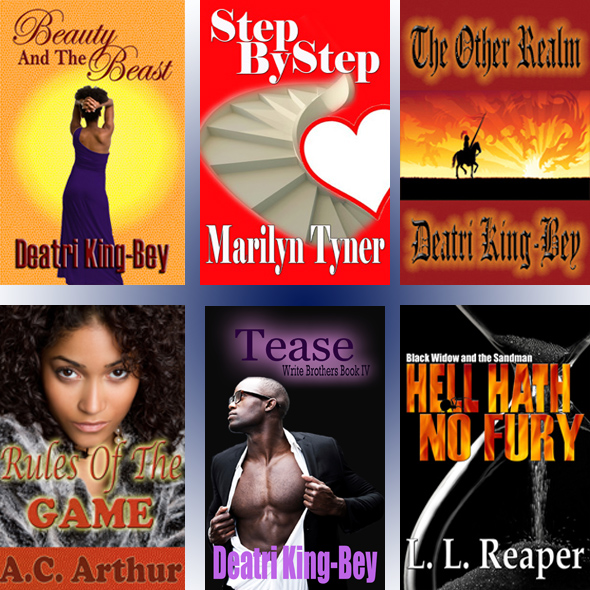
Below are a few of the covers I’ve designed. Please note. I am not a cover designer and am not looking to design covers for anyone. I’m showing these as examples of covers of various genres and tones. Some are populated. Others not. Some have multiple elements that had to be manipulated. Others a singe photo with fancy font.

CoverSamples

What information do you give a cover designer?

  • Genre and back cover blurb
  • A description of the characters (if using populated cover)
  • Cover concept (if you have one)
  • Key themes of the book
  • Colors you do not want
  • Colors you’d like if they look right

It’s important to remember that a cover artist is an artist. It’s best to give them general concepts then allow them to be creative. Hopefully, they’ll make something better than you imagined.

Before you hire a cover artist, be sure to document:

  • Timeline of the project
  • How many different cover samples they will allow you to choose from and that a font change does not constitute a different sample
  • How many updates they will allow on the design you choose
  • Cost and payment options
  • Exclusivity
  • The size(s) of the final cover image(s) they’ll be giving you
  • If they will be giving you the editable file and the cost (if they charge).

If you want to design your own covers, be sure to learn how to use the software and study covers. When I design a cover, I usually have three concepts that I show readers of the genre. I let them give feedback, then I go back to the drawing board.

Now do me a favor and say NO to sucky covers.

If you found this post helpful, please use the Share buttons to spread the word about it.


Don’t have a copy of Become A Successful Author? What are you waiting for?Become A Successful Author is used in the “How To Write That Novel” course at Chicago State because it covers everything from branding to writing to editing to formatting and uploading electronic and print books to marketing and so much more. Your time is money. Look at all the time, thus money, you’ll save by ending your search for answers: Purchase Become A Successful Author for only $4.99 (eBook) or$9.99(print) from: Amazon (US), Amazon (UK), Barnes & Noble

Work At Your Titles By W. Terry Whalin

W. Terry WhalinYou can’t underestimate the value of a good title for a magazine article or a book manuscript. Many writers don’t put much energy into those few words since they figure it will be changed in the editorial process. That’s not true. If you choose a good title, I’ve found it will remain and appear in print for the magazine article or the book.

Those few words are the first thing an editor will see with your submission so don’t slap something on the top of your manuscript then never revisit the title before you send it to the editor.

For some writers, the title can be a stumbling block–since it’s the first thing on your manuscript. To get around this difficulty, often I will throw the first thing that comes to my mind into that spot on the page. BUT I always revisit it at the end of the process, create several titles, and then select the most appropriate one before I send it off to the editor.

Titles come from many different places. Sometimes they are a play on words and for other titles, they are buried in a phrase inside the actual article or book. When I was on the staff of Decision magazine, we spent hours in Title Meetings where we debated the merits of a particular title for an article. Why? Because at the time the magazine had a circulation of 1.8 million copies and we knew a good title would draw readers. Each of us would suggest possible titles, and then we selected what we determined as the best title for that article. If the writer proposed a good one, then it stuck.

Some of my personal favorites are: Two Words That Changed My Life, the title of my personal testimony, http://www.terrylinks.com/TWTCML  A Strange Place To Sing, a children’s book I wrote about Paul and Silas in jail; Never Too Busy, another children’s book about Jesus and the children and finally Lessons From the Pit which I wrote about the Eurodollar Pit of the Chicago Mercantile.

Titles are definitely worth a bit of your creative thinking. The title might make the difference whether you get the editors’ attention or not.

If you found this post helpful, please use the Share buttons to spread the word about it.

W. Terry Whalin is a former magazine editor, book editor and literary agent. He is the creator of an online course to teach writers how to create excellent book proposals, www.WriteABookProposal.com (http://bit.ly/wbkpro) and an Acquisitions Editor at Morgan James Publishing, a NY based publisher (http://terrylinks.com/mjp1s).  Get his free Ebook, Platform Building Ideas for Every Author: (http://bit.ly/wtwsite) Terry has almost 40,000 followers on Twitter: www.twitter.com/terrywhalin


Don’t have a copy of Become A Successful Author? What are you waiting for?Become A Successful Author will be used in the “How To Write That Novel” course at Chicago State because it covers everything from branding to writing to editing to formatting and uploading electronic and print books to marketing and so much more. Your time is money. Look at all the time, thus money, you’ll save by ending your search for answers: Purchase Become A Successful Author for only $4.99 (eBook) or $9.99(print) from: Amazon (US), Amazon (UK), Barnes & Noble
Formatting Is Your Friend

DeatriI’m a read-a-holic and always looking for new authors to feed my addiction. I’ll read just about anything, but have come to the point where I refuse to purchase another horribly formatted eBook. Don’t get me wrong. I understand that when manuscripts are converted to eBooks, the formatting can have issues here and there, but what I’ve been seeing is way past the limitations of conversion programs.  I’d also give a free pass to authors if instructions weren’t readily available online for free, but they are. So as a reader I feel that the if an author doesn’t care about his/her work enough to take a few minutes to format it correctly, then chances are this author didn’t take the time or expense to invest in proper editing. Instead of complaining—well, just complaining—I want to be part of the solution. Below please find instructions for formatting a manuscript so you’ll have fewer issues when you convert it to an eBook.  Following the eBook formatting are instructions for print book formatting.

Formatting
The steps below are for Microsoft Word 2007, but the same principles apply no matter what word processing program or version you use. The Help feature in your program is your friend. Please note: There is more than one “right” way to format a book. This is one of them. With minor tweaks, you can update your eBook-formatted manuscript for other purposes. Always check with the publishing houses and/or agents you send your manuscripts to. Each may have their own guidelines. It’s simple to change margins and spacing (most want 1-inch margins and double spacing).

eBook Formatting

  • Set your margins 1 inch around.
  • Font: Georgia is currently my font of choice. I find it easier to read, but my version of easier may not be your version. Other widely used fonts are Times New Roman and Veranda (some find this clunky). Not all conversion programs (programs that convert your word processing file into an eBook) are created equal. Some will automatically convert fonts it doesn’t recognize to a font it does recognize. To minimize worries about font type, I believe Times New Roman is accepted by just about all of the eBook converting programs (ECP) out there.
  • Different ECPs accept different font sizes. To be safe, stick with 10pts, 12pts, 14pts, 16pts, and 18pts. I skipped the odd sizes on purpose because there are ECPs that only accept these sizes. If your font size doesn’t work for the ECP, most will either increase or decrease the font size to one the ECP accepts.
  • Feel free to use bold, underline and italics with most ECPs
  • With ellipses (…), the Chicago Manual of Style recommends using a space between each period (. . .). In my opinion, it’s best to not take them up on this recommendation and should be ignored when formatting your manuscript to keep from ending up with a manuscript where two periods can be on one line and the third period on another line. And for those of you who say you MUST follow the Chicago Manual of Style or publishing houses will not accept your manuscript. This is one recommendation many publishing houses also ignore. And if you are still worried about using the word processors ellipses, the good old folks who maintain the Chicago Manual of Style even say it’s okay to use the word processors ellipses: Chicago Manual Of Style reference. Just be consistent.
  • Justify the text (Ctlr+j), which gives it that clean even look on the right side of the margins.
  • You may Center chapter headings.
  • Use Page Break to start a new page for your chapters. Place the curser on the new line, then from the main menu go to Insert, then Page Break.
  • Most ECPs will create a new page if you have more than three consecutive blank lines. I know many of you like to start your chapters a few lines down the page, just don’t start that line more than three lines down or you may insert a bunch of blank pages into your manuscript.
  • Use something physical instead of a blank line for scene breaks, and Center your scene breaks.
  • You can use an image (be sure to center it), but some ECPs have issues with images. For my eBooks, I just use keyboard characters to avoid this.
  • Do a search on the Internet for free decorative scroll. Ensure they release permissions for commercial use. Select a few you like, then resize them and use them for your books.
  • You can also use characters available on your keyboard. I’ve seen some publishing houses use something as simple as … Yep. An ellipsis. But if you have to use characters, I say go for it. The greater than and less than sign may not be the most beautiful, but I think they are better than an ellipses, or use a tilde. For example: <><><><><><>, <<<<<<>>>>>>, >>>>><<<<><<>><<>>, ~~~~~~~ or * * * * * *. Stay away from special characters in eBooks because some of the ECPs won’t recognize them and you may end up with a bunch of squares or whatever to replace them in the conversion. Trust me when I say I learned this the hard way.
  • With eBooks, the best practice is to indent the first line of a paragraph (without using tab). I say this because some ECPs will automatically place a blank line between paragraphs and others won’t. By indenting the first line, you won’t need two different files to submit. Don’t worry. It is acceptable to have that blank line and indentions in eBooks. Just ensure your manuscript is consistent.
  • Do not use the “Tab” key. Instead, set your Paragraph setting.
    o Right click your mouse
    o Select “Paragraph” from the menu
    o In the Indention section, for Special select “First Line,” then for “By” make it .3. Now .3 is my preference for eBooks and print, but I don’t suggest using more than a .5 or less than .3.
    o While you are in the Paragraph settings, decide if you want a blank line between paragraphs, and for Line Spacing select “Single.” On Line Spacing, some people prefer more space between lines. I like single-spacing because sometimes the ECPs adjust the spacing for some paragraphs and not others when I use more than “Single” spacing, which makes the manuscript look sloppy. It’s not consistent and seems to have no rhyme or reason, which annoys me, so I avoid that issue. I don’t suggest you use more than “Double.” From what I’ve seen, if the ECP doesn’t accept the Line Spacing you have selected, it will select what it determines is the closest to something it uses. Now when you send your manuscript out for editing and as a submission, be sure to change this to double- spacing.
  • Do not include page numbers, headers or footers in your eBook versions. If you are sending it out for submission or for editing, be sure to include the heading information (book title, author name and page number).
  • This post is about fiction, but if you venture into nonfiction, most ECPs can’t handle bulleted lists very well. Okay, let’s be honest, eBooks have quite a few limitations formatting wise. You won’t hit many of the issues when you release fiction.

That’s it. If you’ve already written your manuscript, reformatting margins and such is easy. The most complicated part is if you’ve used Tabs in the manuscript. To clear the Tabs out and set indentions:

  • Highlight the entire manuscript (Ctrl+a)
  • Delete all Tabs
  • Find and Replace all
    o Ctlr+f : On the replace tab, Find what:^t
    o Shift+6 = ^
    o On the Replace with:
    There is nothing in the replace, thus you are replacing the tabs (^t) with nothing. This removes the tabs.
  • Highlight the entire manuscript (Ctrl+a)
  • Follow the instructions in the eBook formatting for setting the indention.
  • Anything centered will be indented, so you need to scroll through the manuscript and correct that.

My eBook conversion programs of choice are MobiPocket (to create the Kindle file) and Calibre (to convert the Kindle file to ePub)

Don’t worry; it’s much easier than it sounds. Once you get in the groove, you’ll be amazed how fast you’ll have a good-looking manuscript. Now when you convert your manuscript, be sure to scroll all the way through and check for paragraphs that may not be indented or indented too much or items not centered and such.

If you don’t have an eReader, be sure to view your converted eBook in Calibre or download Amazon’s and Barnes & Noble’s eReaders for your PC to view the eBook file you create, then make adjustments as needed before you upload into the online stores.

ePublish with Amazon, Barnes & Noble, iStore

Print Book Formatting
You’ll like this part. Take the file you formatted for eBooks and update it for a print book. First, you need to decide what size you want your book to be. If you read the print version of Become A Successful Author, it’s 6 x 9. Go to the library and/or bookstore and take note of what the popular sizes of books in your genre are. While you are there, pay attention to the price also. I’ll come back to price later.

Now that you know what size you want your book to be, you need to know how to set your margins. Just about every print company I looked into had templates you could download for the basic size books they offer or they’d email one to you. If you want a custom size, you may have to contact the company and ask for a template or specifications for that size and ensure they’ll print the size you want.

A template will show what your margins should be, the header, the gutter, all that good stuff. Many times the template will be a blank Word document that you can just copy all of your manuscript (Ctlr+a) and paste into the template (Ctlr+v), then you change the header accordingly. If you use a template, don’t be afraid to make adjustments.

Here are a few additional items to consider when converting to print format.

  • The more pages, the greater the expense. The larger the size, the greater the expense.
  • You get to have more fun with the font. Don’t get too wild and crazy with the body of your text, but why not make the chapter headings and scene breaks something snazzy.
  • You don’t have to start chapters at the top of the page. I wouldn’t suggest going more than a third of the way down to start. Be consistent.
  • I know the smaller the font size the fewer pages, therefore, the lower the cost, but say no to eyestrain. Don’t go smaller than 8 pts. I like 11 pts and feel that’s plenty small enough. But that’s me. If you are creating a large print book (16 pts or greater), be sure to indicate Large Print on the cover and in your product description.
  • Front matter (the pages before the novel starts, such as title page, copyright page, acknowledgments) has a specific order. You can refer to the Chicago Manual of Style (most libraries carry this) or look at the front matter of a book from any traditional publishing house. Yours should be similar.
  • Be sure that the manuscript portion of your print book starts on an odd page.
  • If you are using a template from a company, it may use the same header for each page. I like my headers to have the the book title on the even pages and my name on the odd pages. If you don’t know how to create headers, in the Help area of your word processor, look up header, footer, section breaks, section headers.
  • Have your front matter be the first section of your book and the manuscript start the second section. Do not have page numbers in the first section of the book. Some people use Roman Numerals, but that’s more common in nonfiction titles.
  • Using Microsoft Office 2007 or later, save the file as a PDF to send it to the printer.

Just say no to poorly formatted manuscripts.

Deatri King-Bey

If you found this post helpful, please use the share buttons to spread the word about it.

As Featured On EzineArticles


Don’t have a copy of Become A Successful Author? What are you waiting for? Become A Successful Author will be used in the “How To Write That Novel” course at Chicago State because it covers everything from branding to writing to editing to formatting and uploading electronic and print books to marketing and so much more. Your time is money. Look at all the time, thus money, you’ll save by ending your search for answers: Purchase Become A Successful Author (eBook) for only $4.99 from: Amazon (US), Amazon (UK), Barnes & Noble  or print copies for only $7.99 by using the Contact page of this website and tell Dee know how many copies you’d like and shipping address. She’ll email the ordering information.